Mom’s Touch Mongolia
press kit.
Logos, brand colors, key facts, and contact details for journalists, partners, and content teams. Everything you need on one page.
Key facts
Dot to dot - people, connected
The Mom's Touch logo is built from lines that connect dot to dot. Each dot represents a person who shares Mom's Touch values; the lines between them stand for co-prosperity - the heart of the brand. The idea behind every store is the same: people, made well, connected through care.
Download
Please do not crop, recolor, or rotate the logo in editorial use.
Official brand colors
The Mom's Touch palette rests on three colors: Patty Yellow for supreme-quality chicken, Town Gray for the warmth of being close to our neighbours, Earth Brown for the respect we hold for natural ingredients. Their harmony is what makes the brand feel sincere.
- HEX
- #F2A900
- RGB
- 242 · 168 · 0
- CMYK
- 0 · 32 · 100 · 0
- Pantone
- Pantone 130 C / 2010 U
- HEX
- #D7D2CB
- RGB
- 215 · 210 · 203
- CMYK
- 19 · 17 · 19 · 0
- Pantone
- Pantone Warm Gray 1 C / U
- HEX
- #473729
- RGB
- 71 · 55 · 41
- CMYK
- 40 · 60 · 77 · 71
- Pantone
- Pantone 7533 C / U
Product photo library
High-quality product shots optimized for editorial, social, and partner use. Click any image to download. WebP format, ~50-300 KB each.
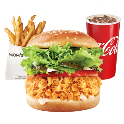
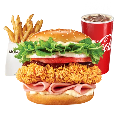
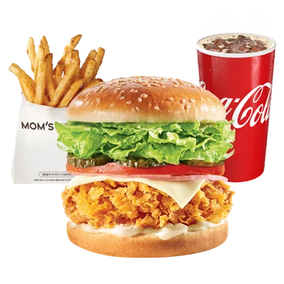
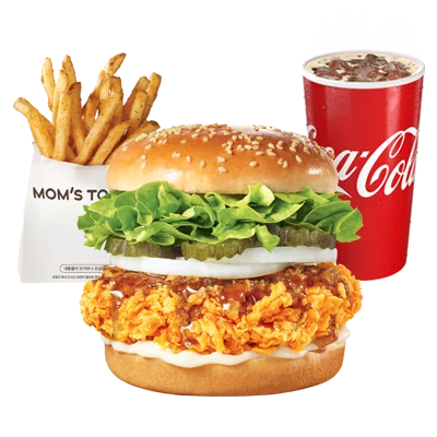
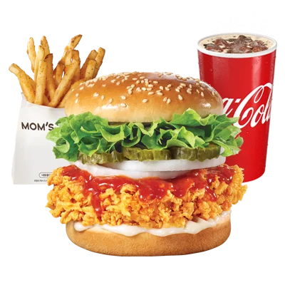
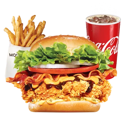
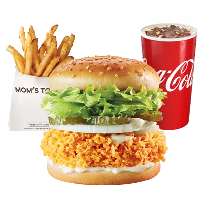
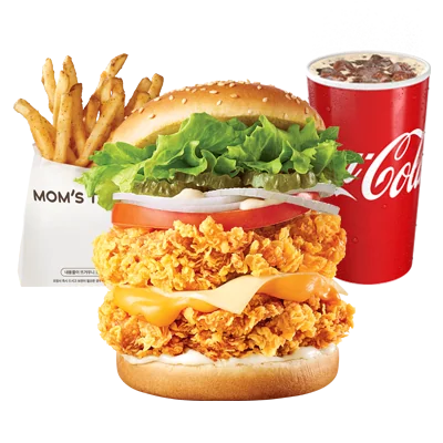
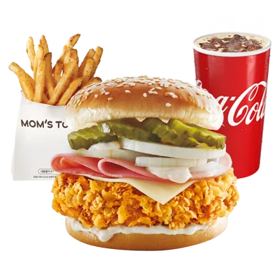
Burger Sets
10 photos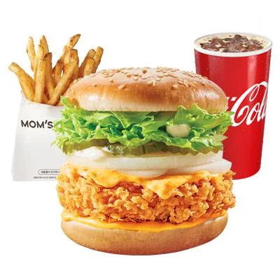
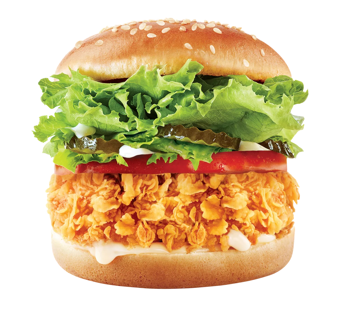
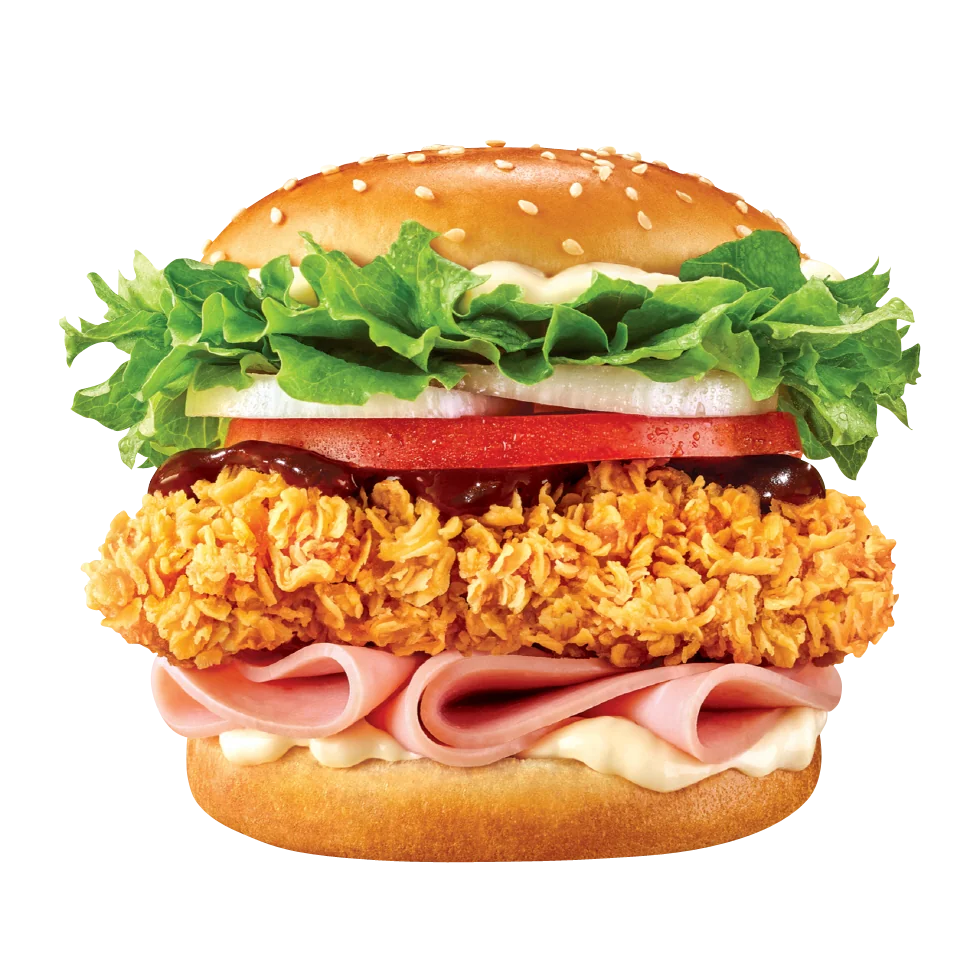
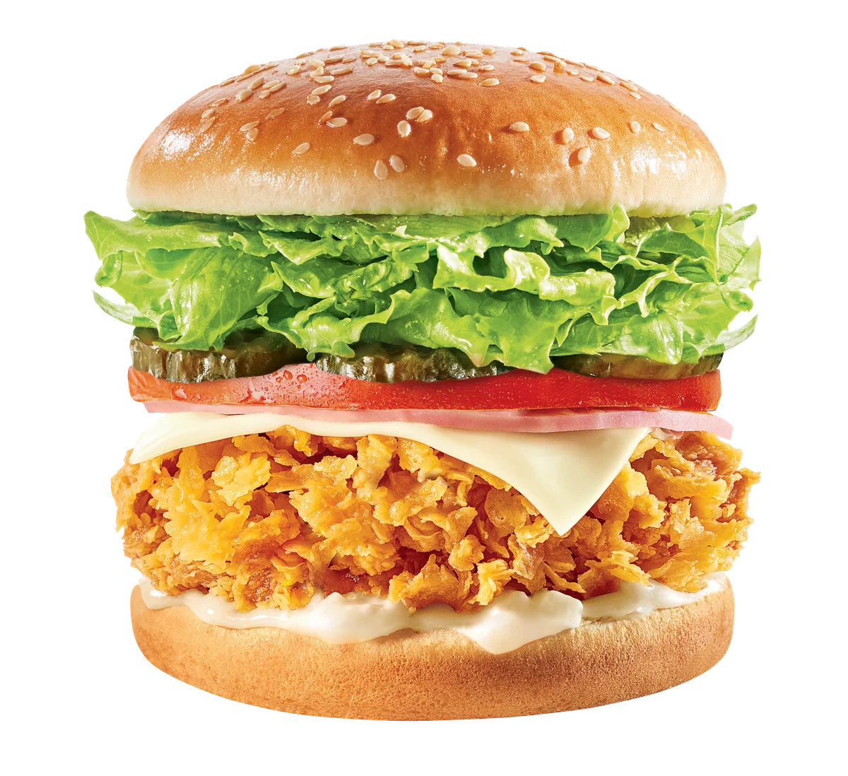
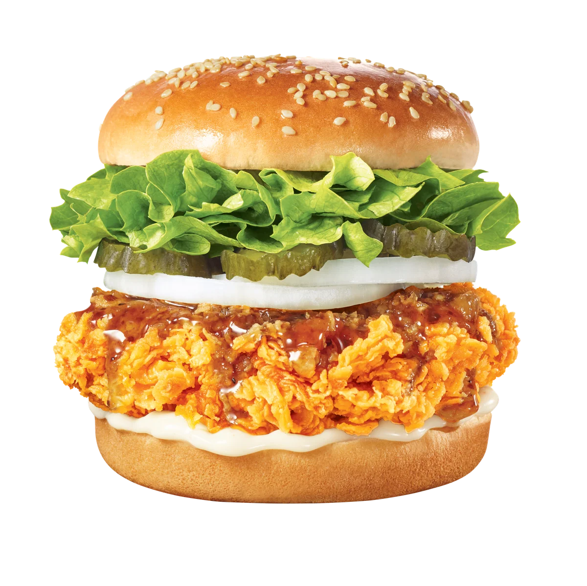
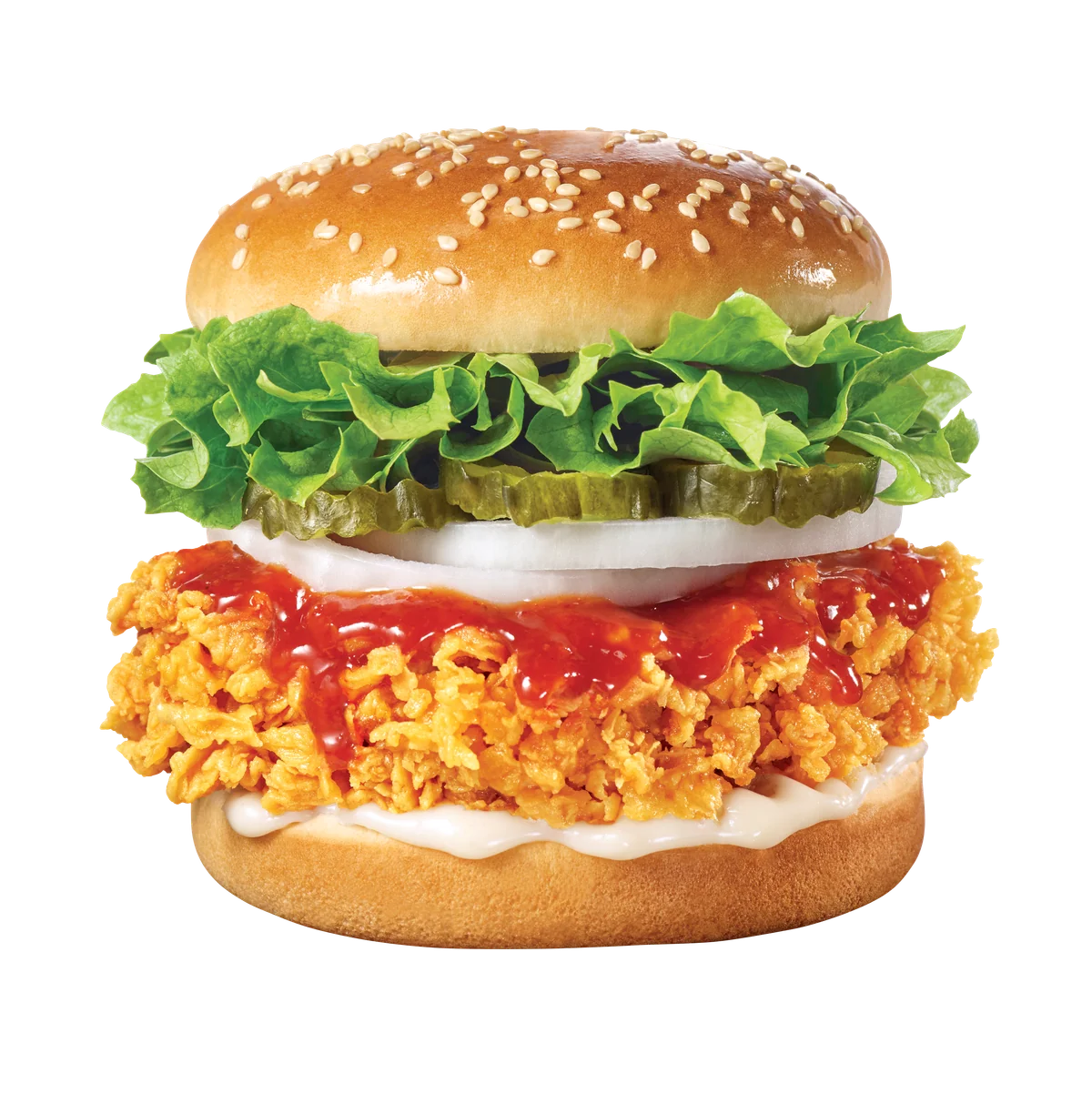
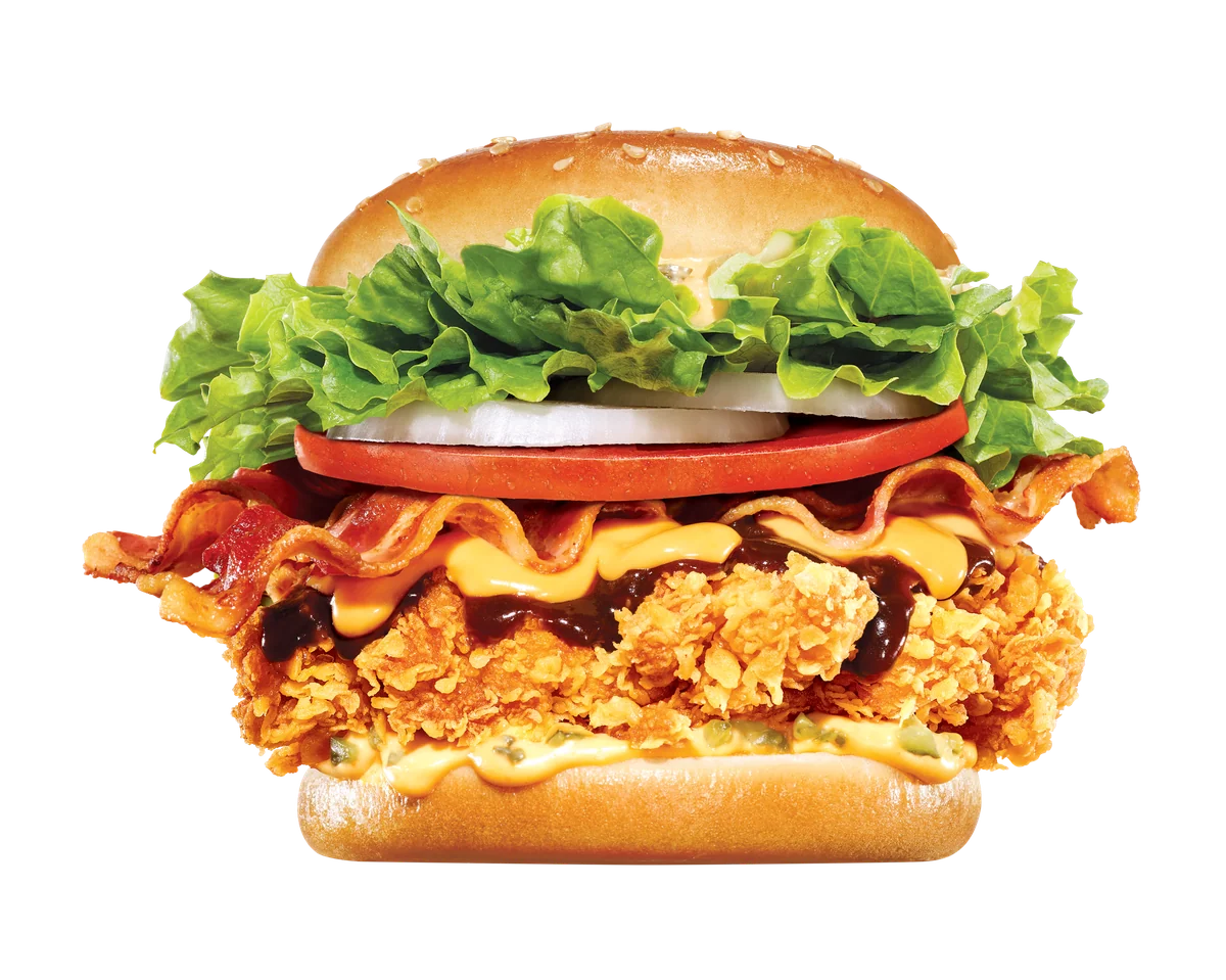
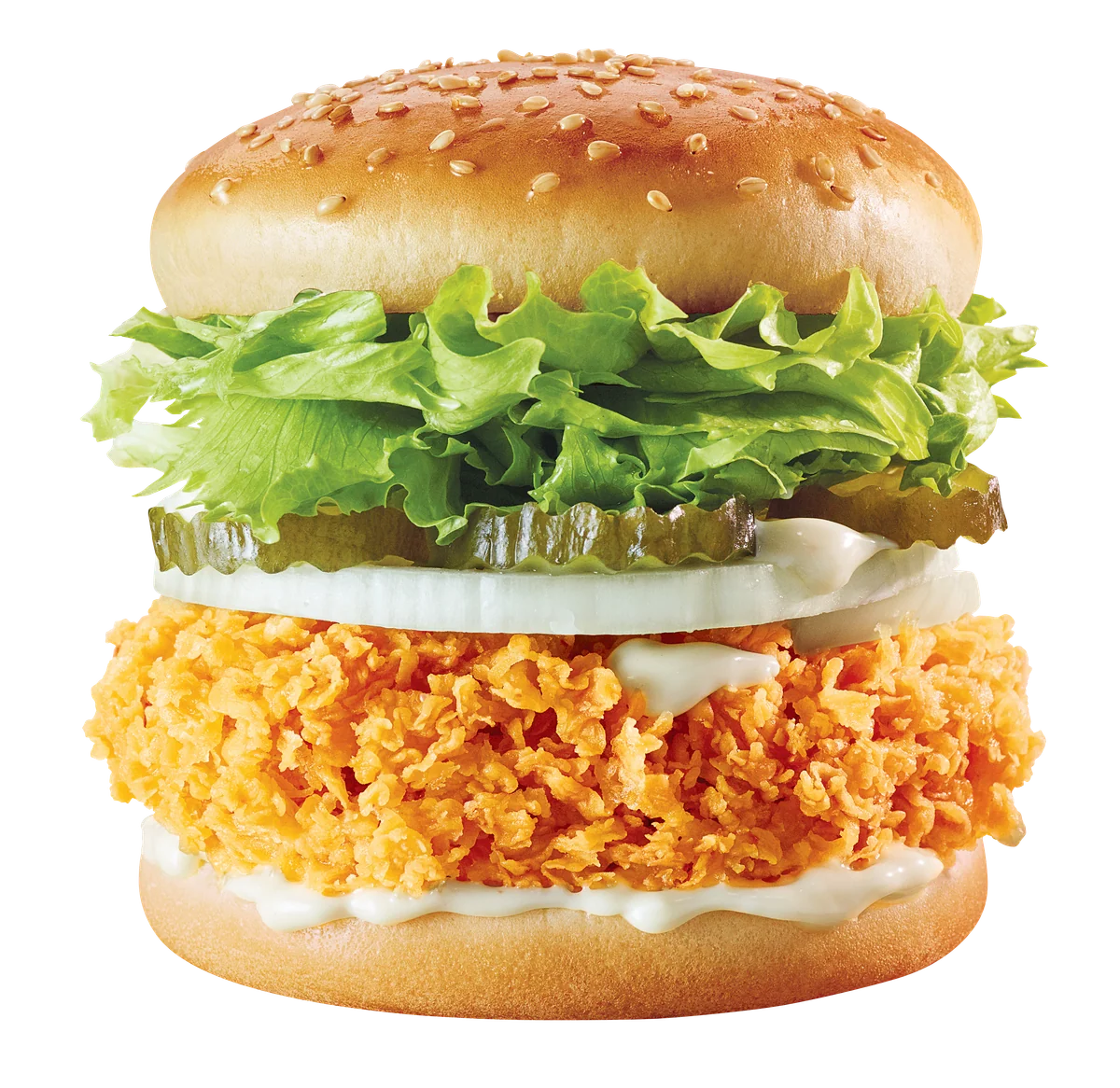
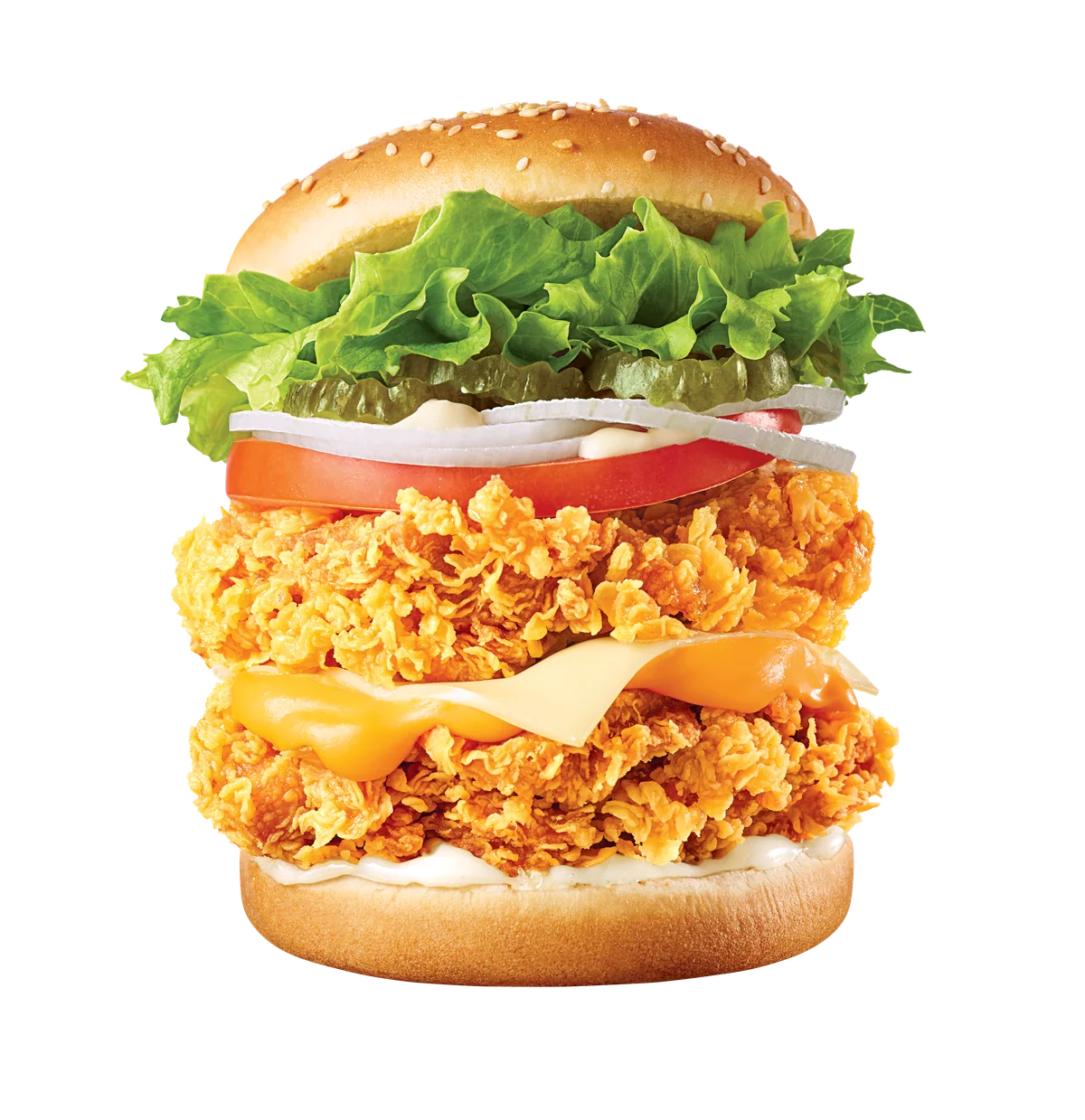
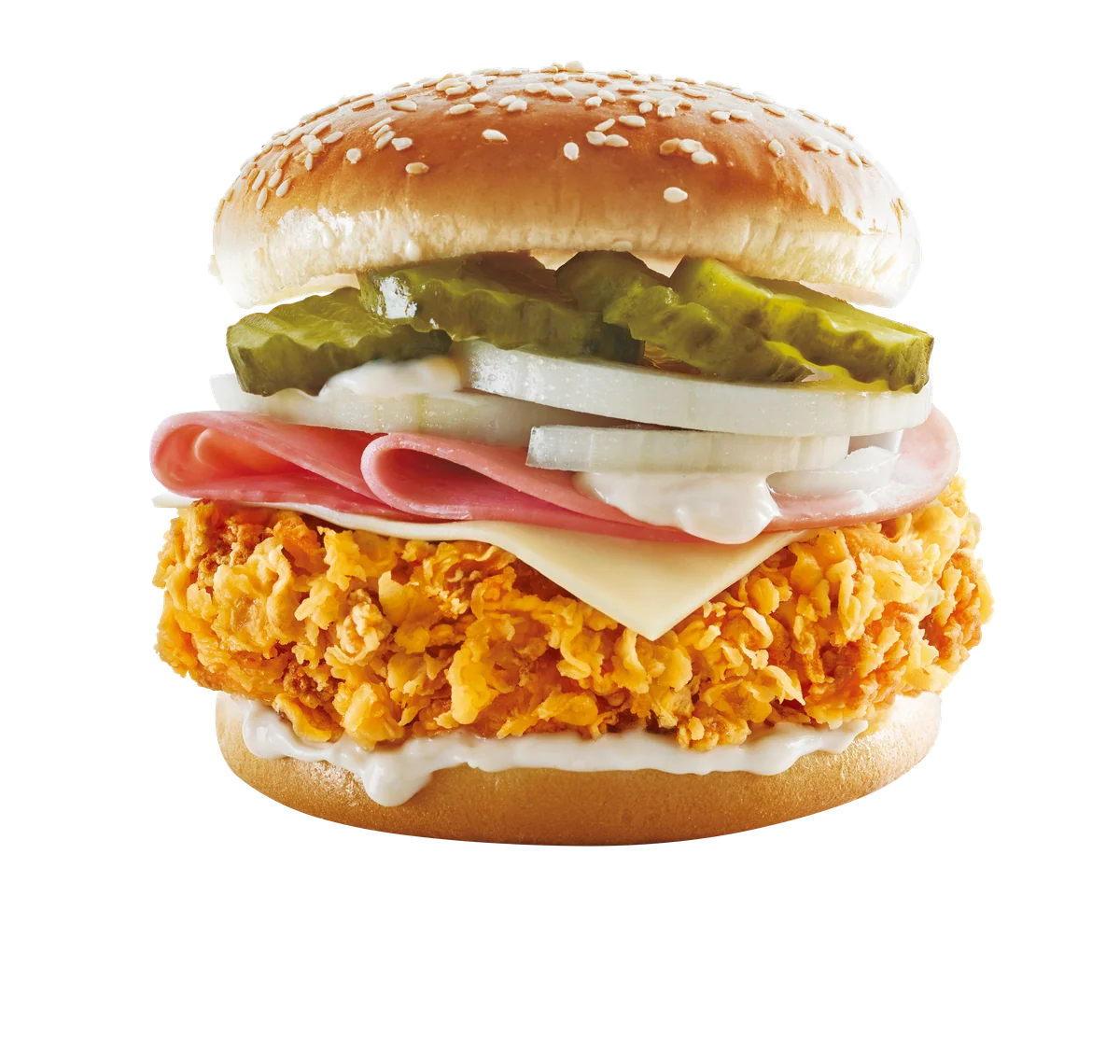
Burgers
10 photos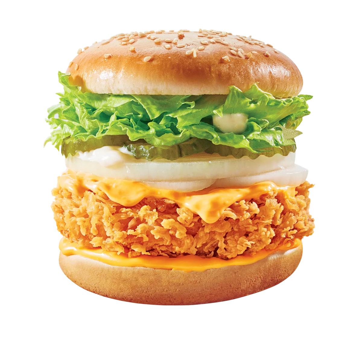
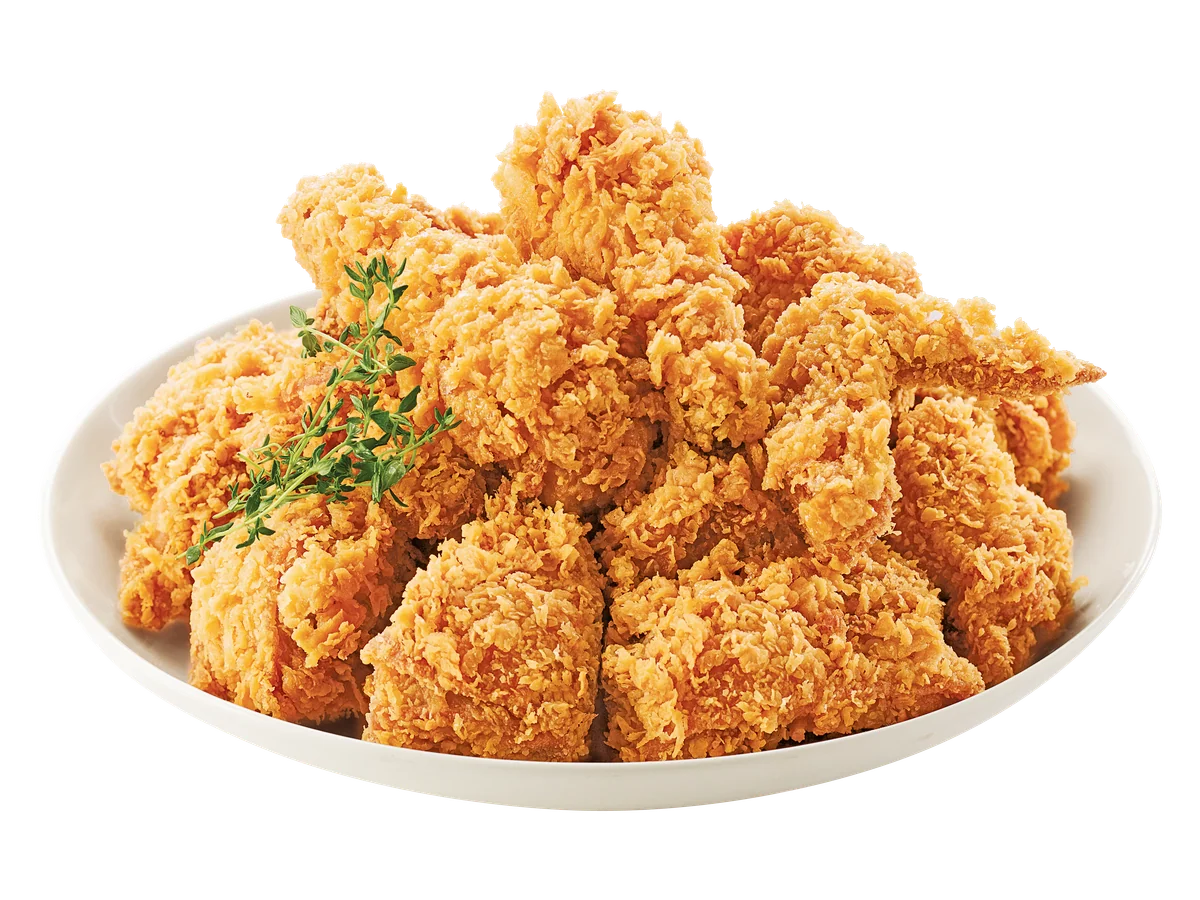
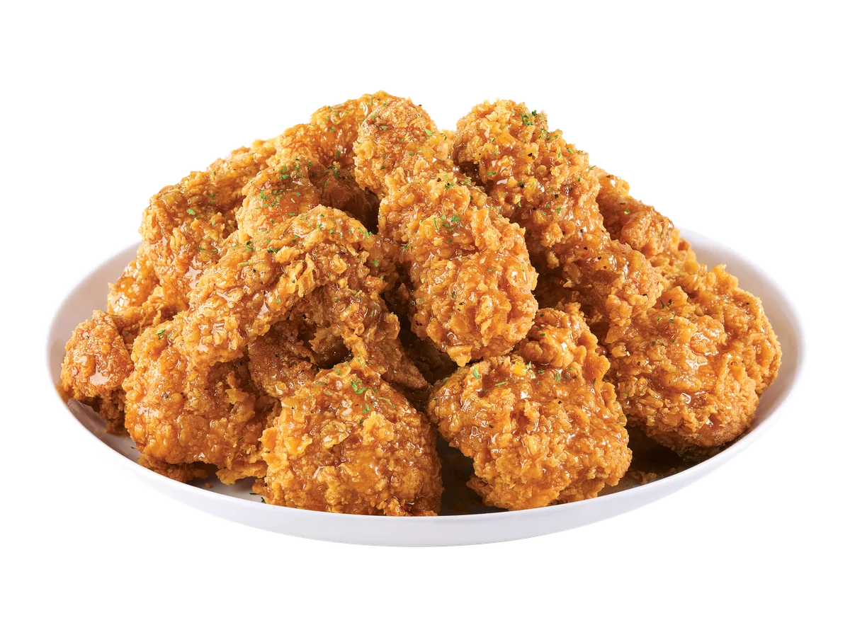
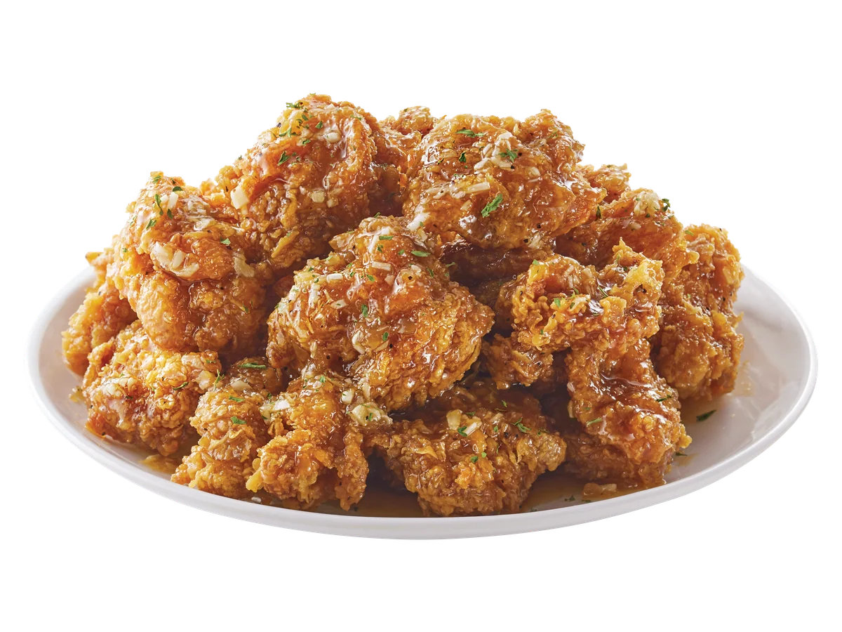
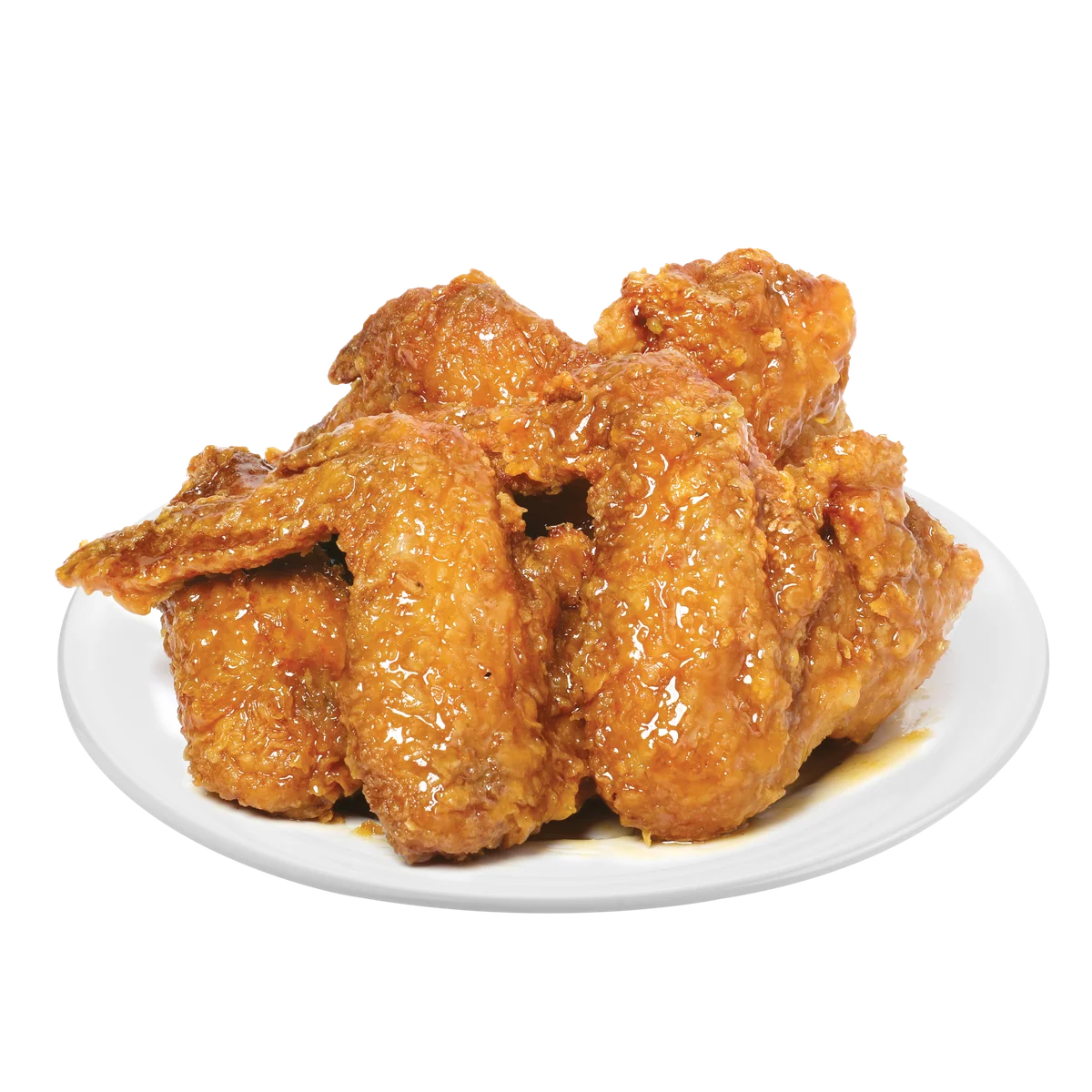
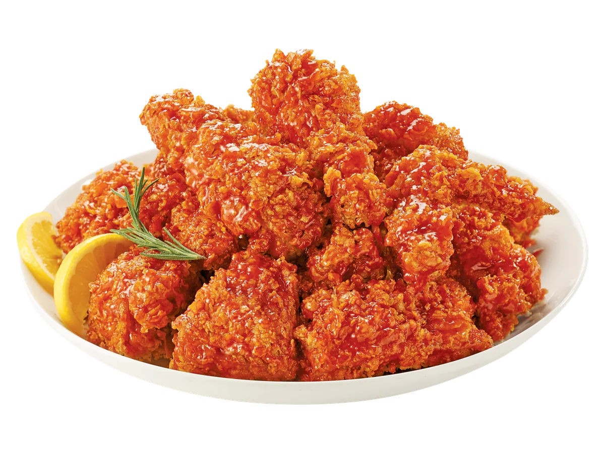
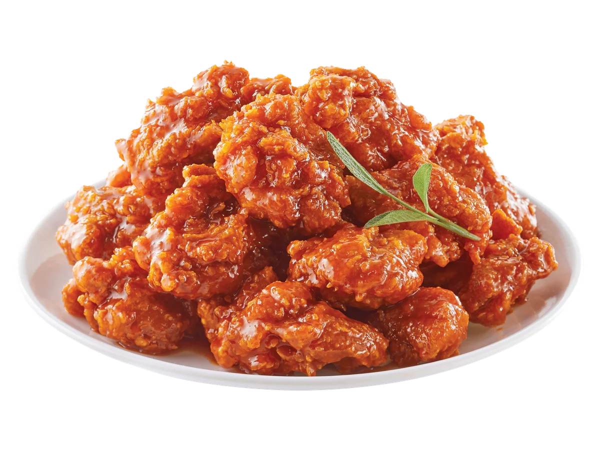
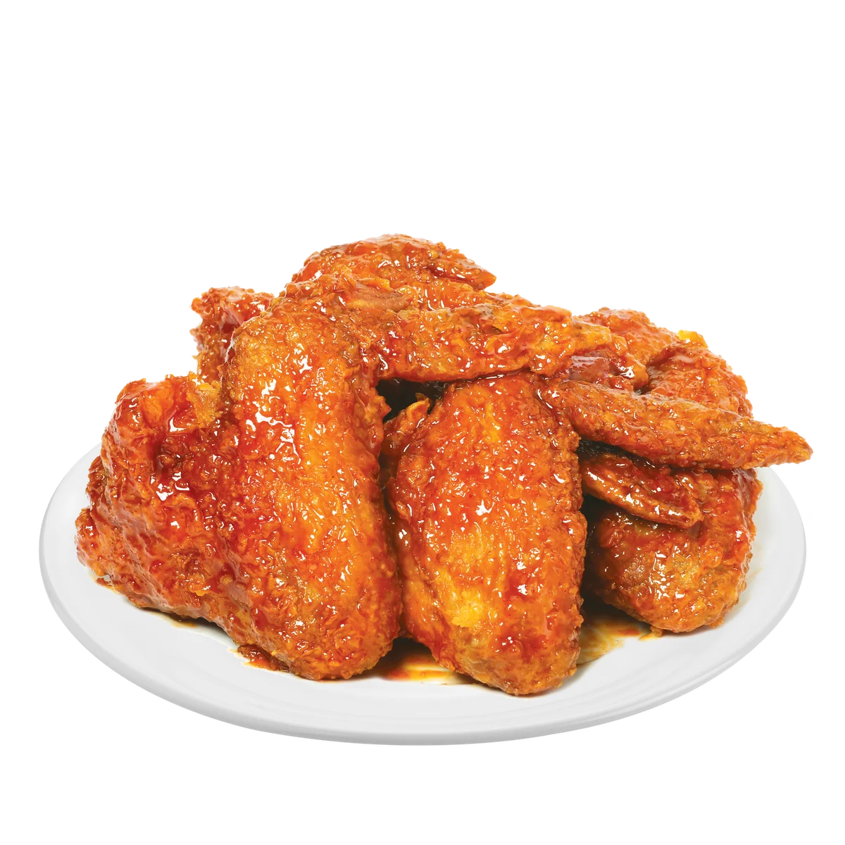
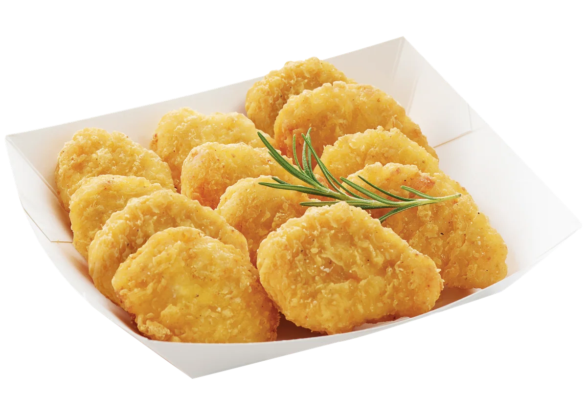
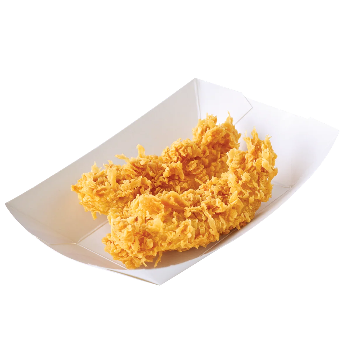
Chicken
8 photos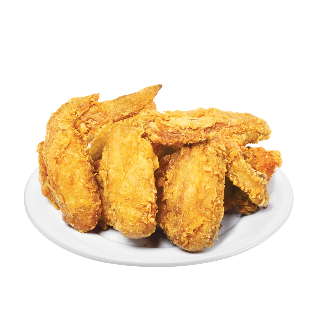
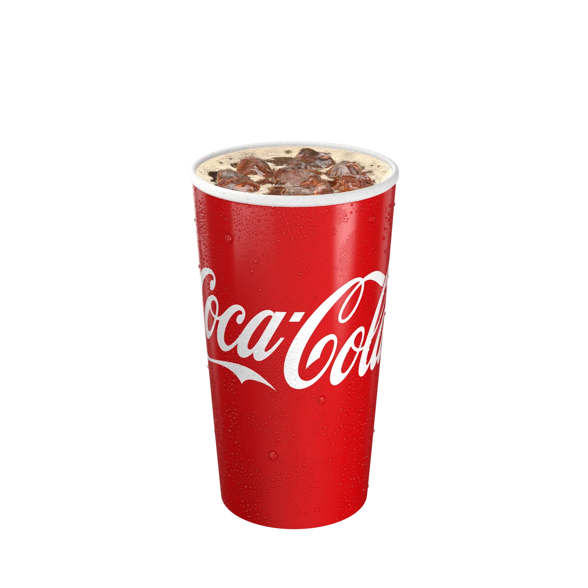
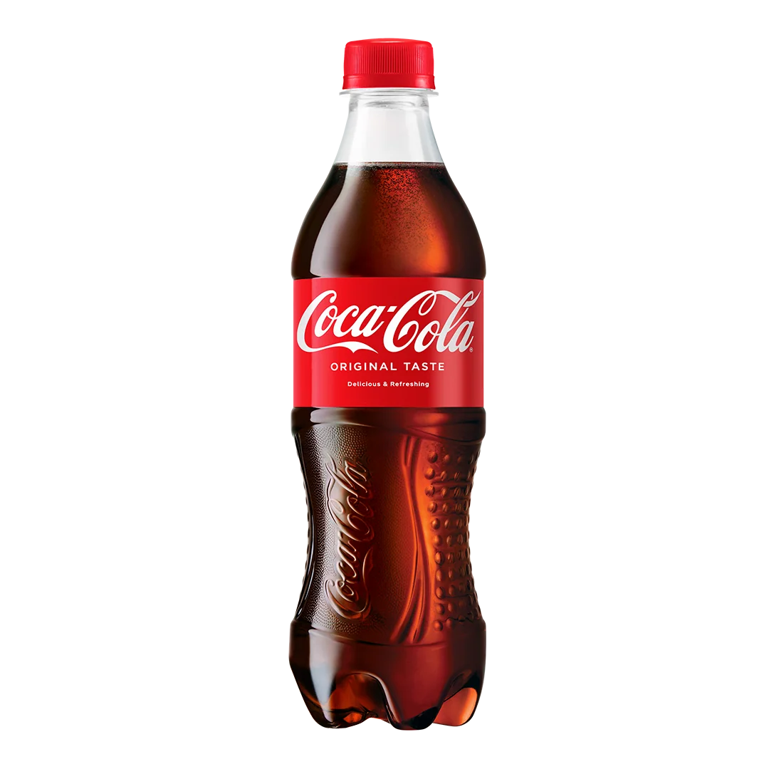
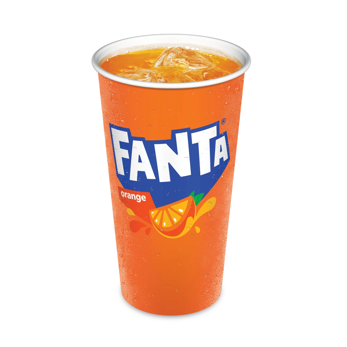
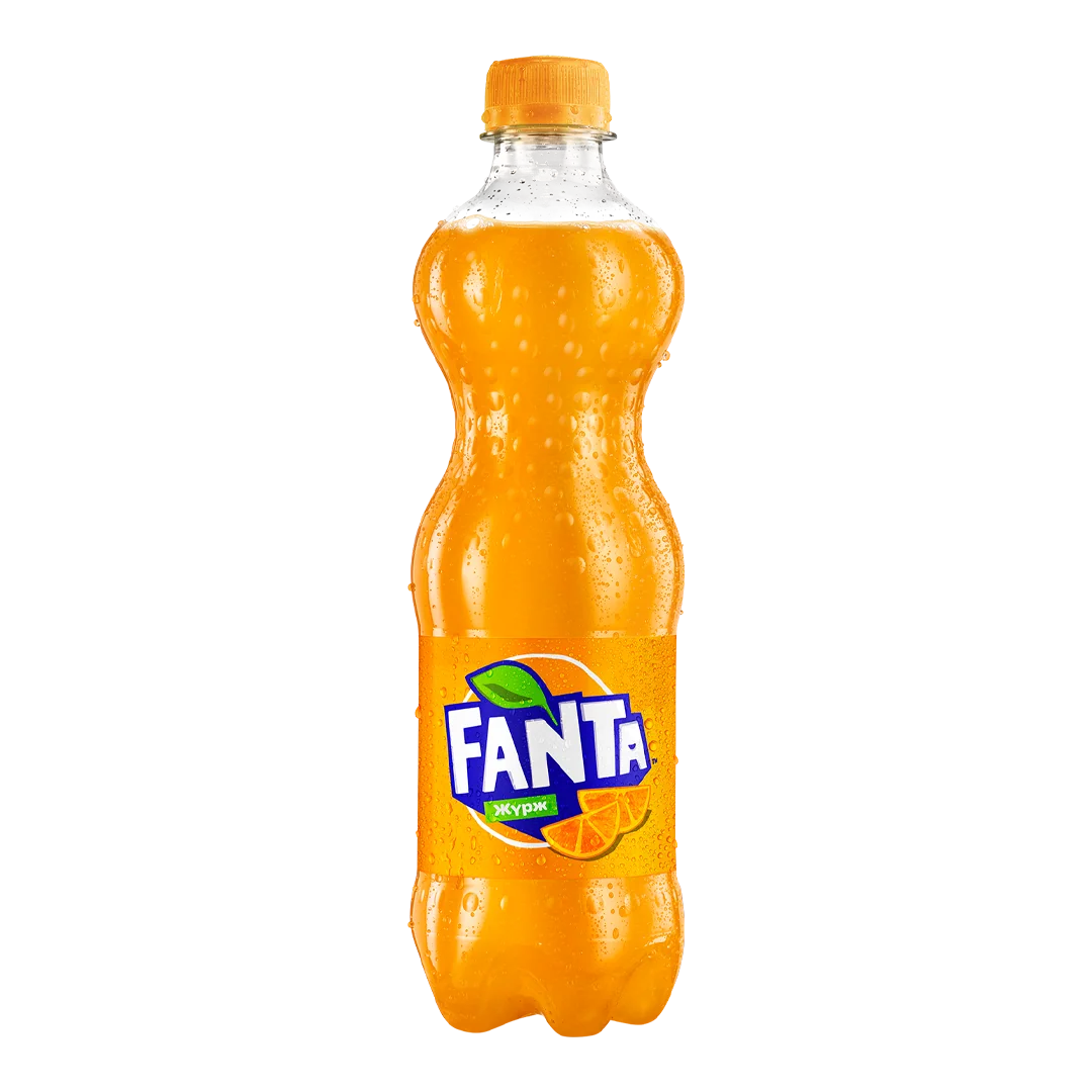
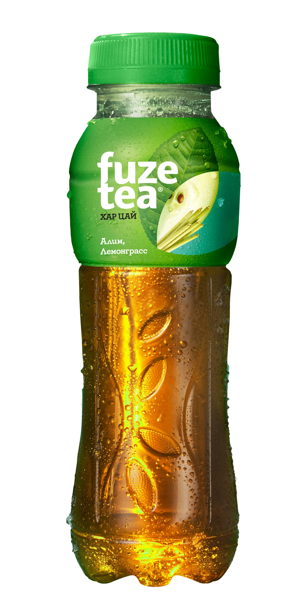
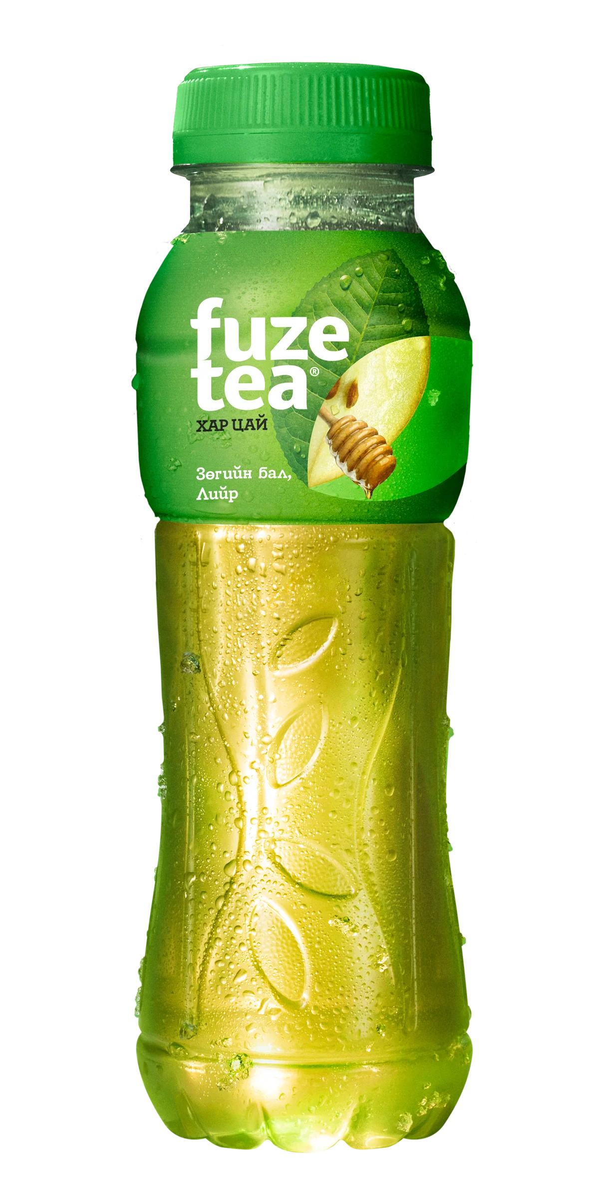
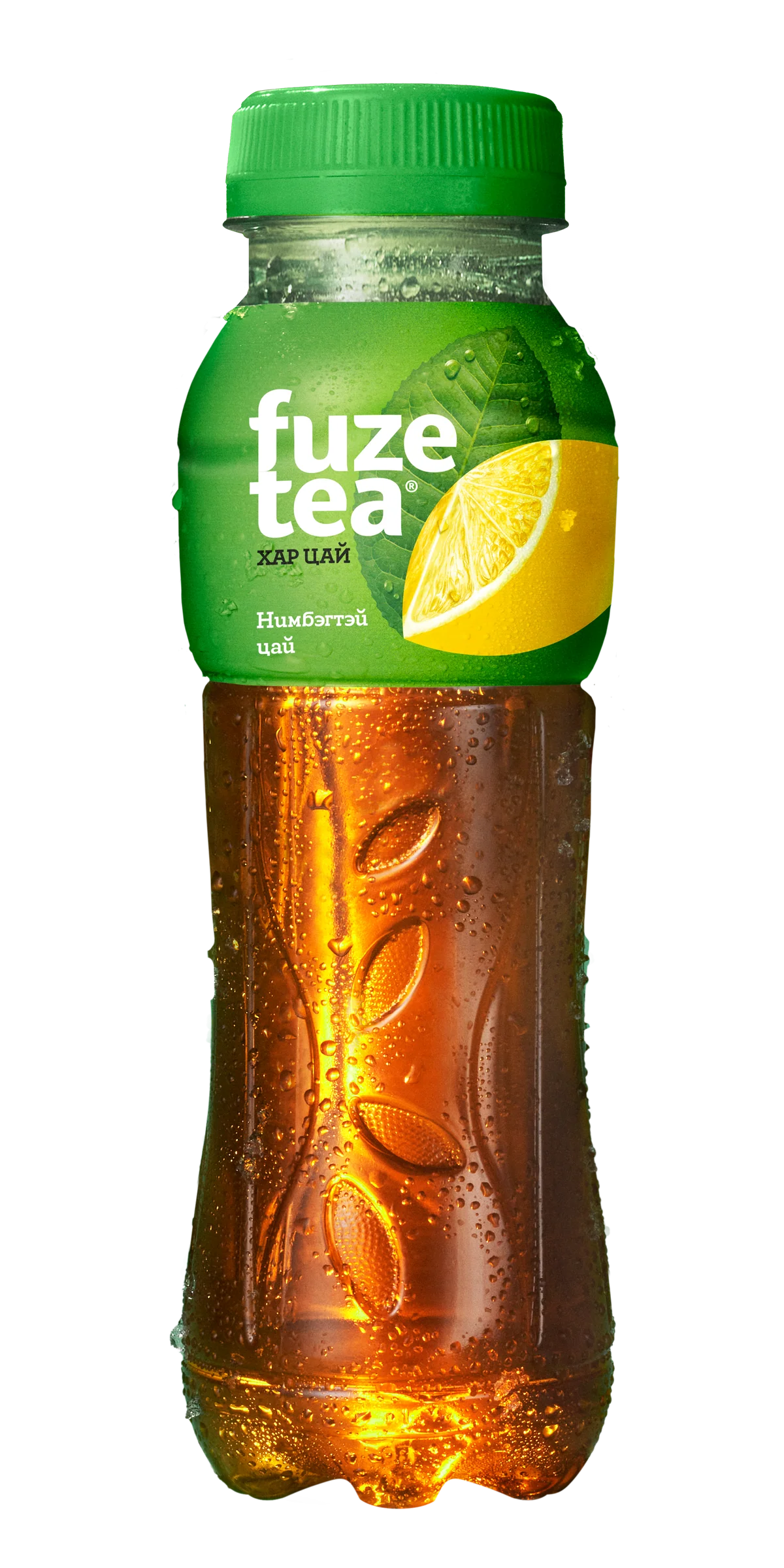
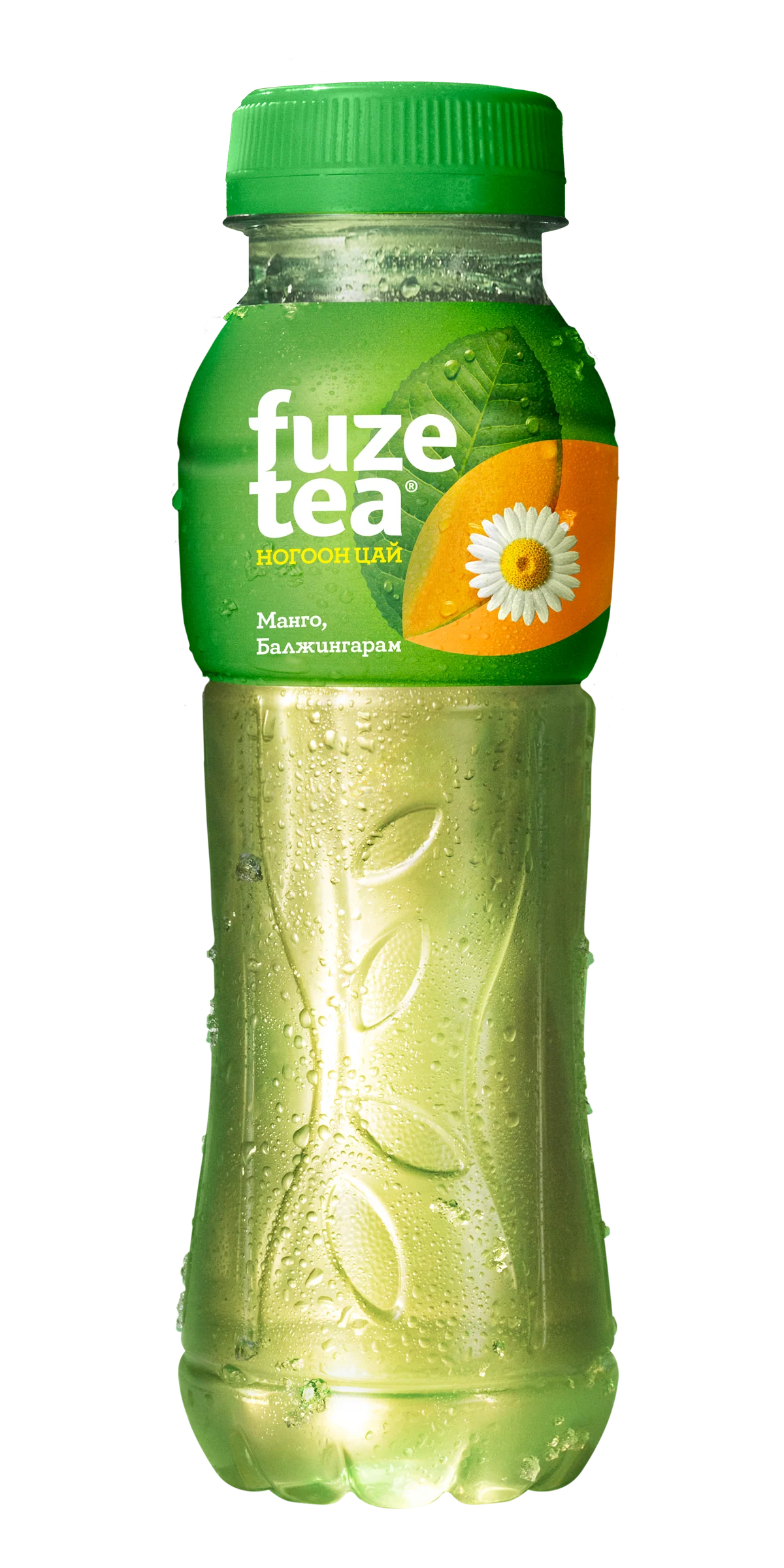
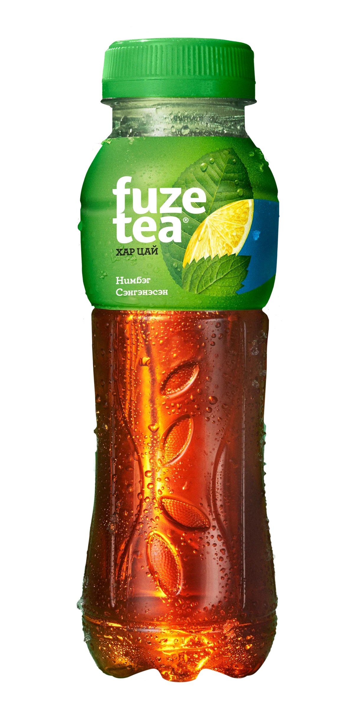
Drinks
12 photos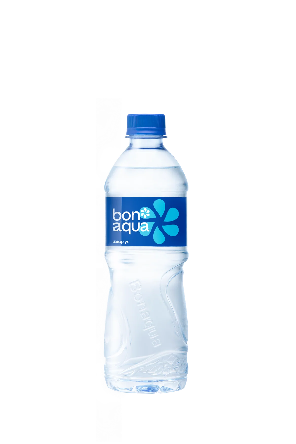
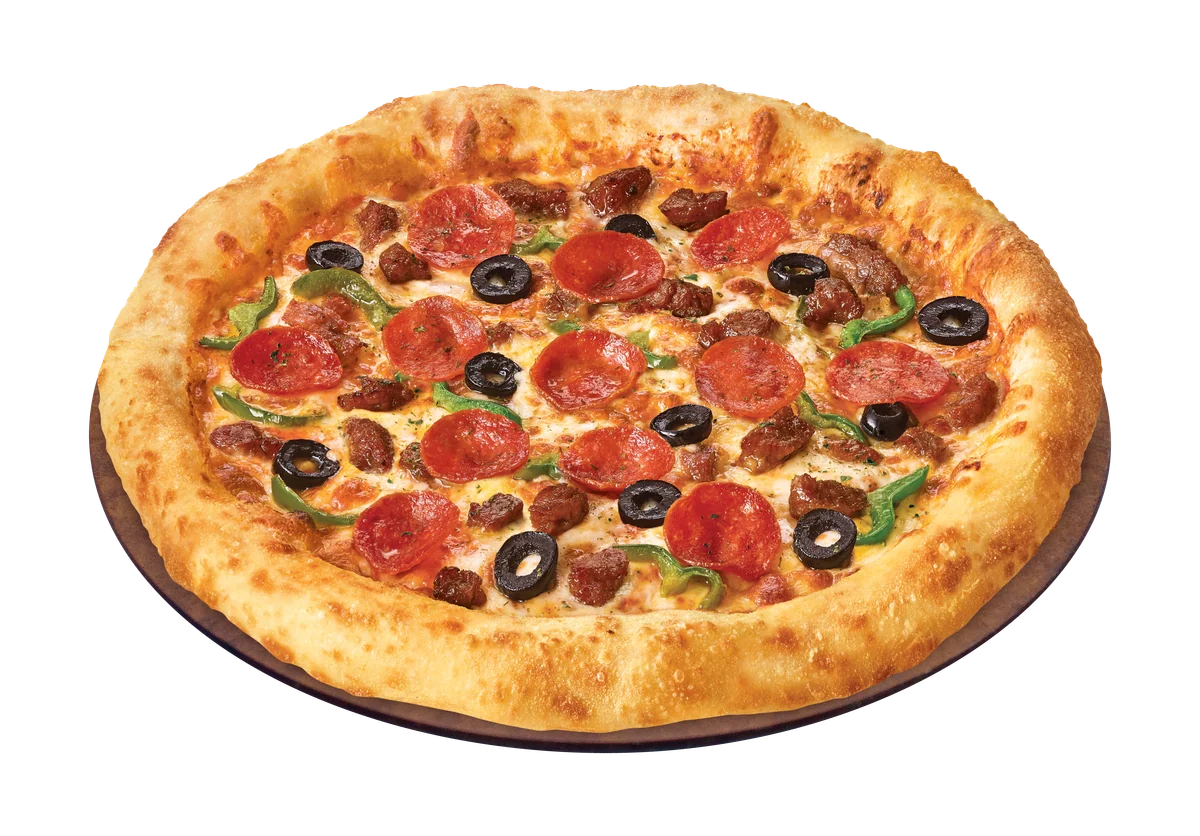
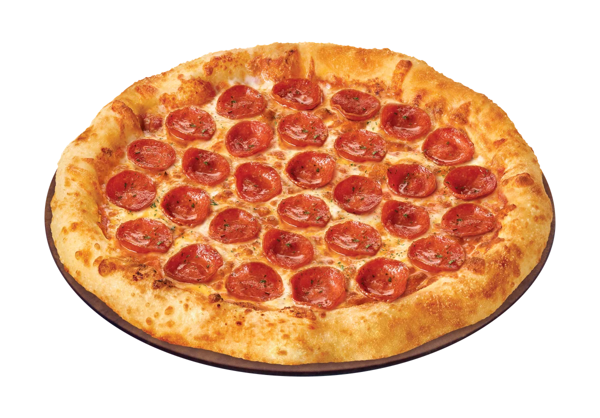
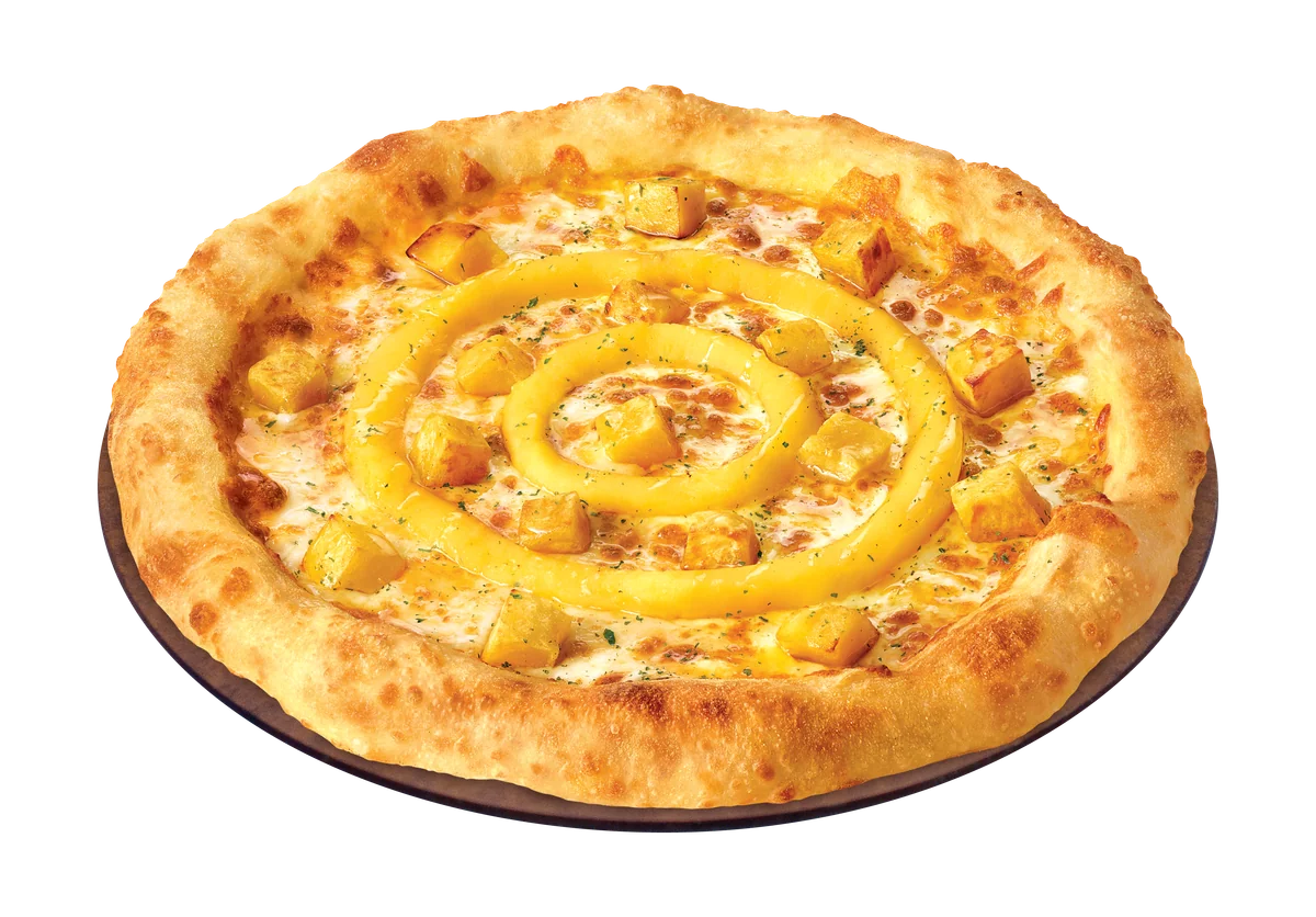
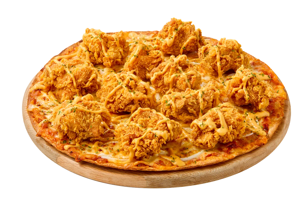
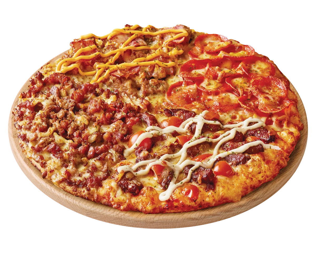
Pizza
6 photos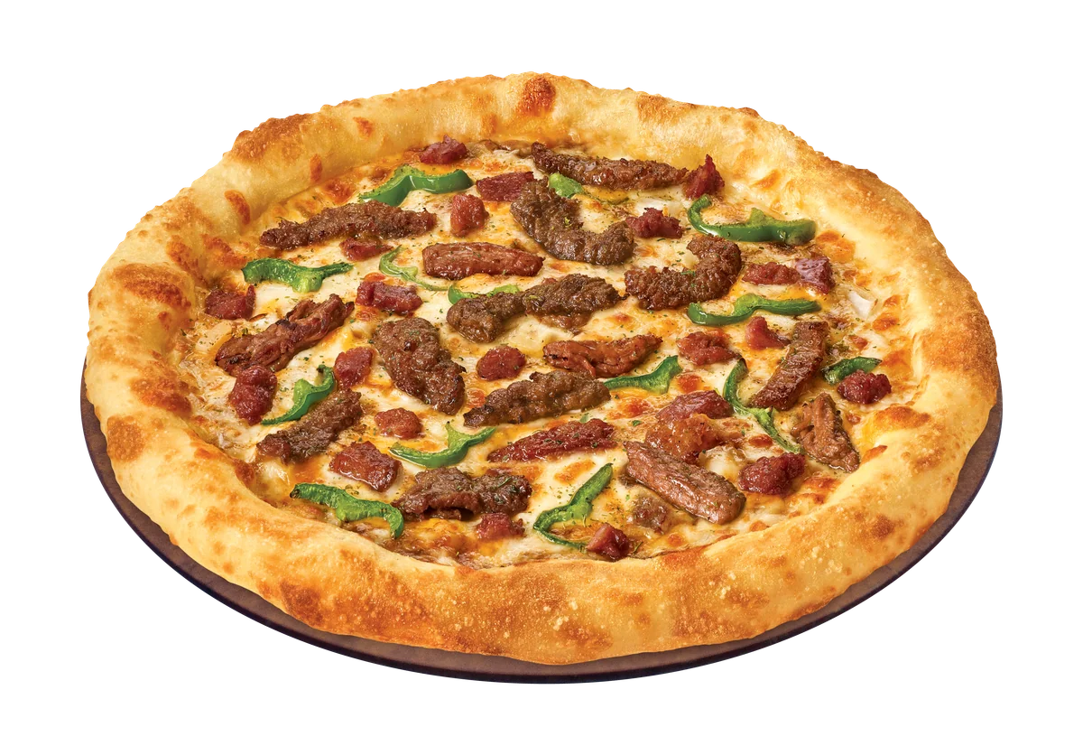
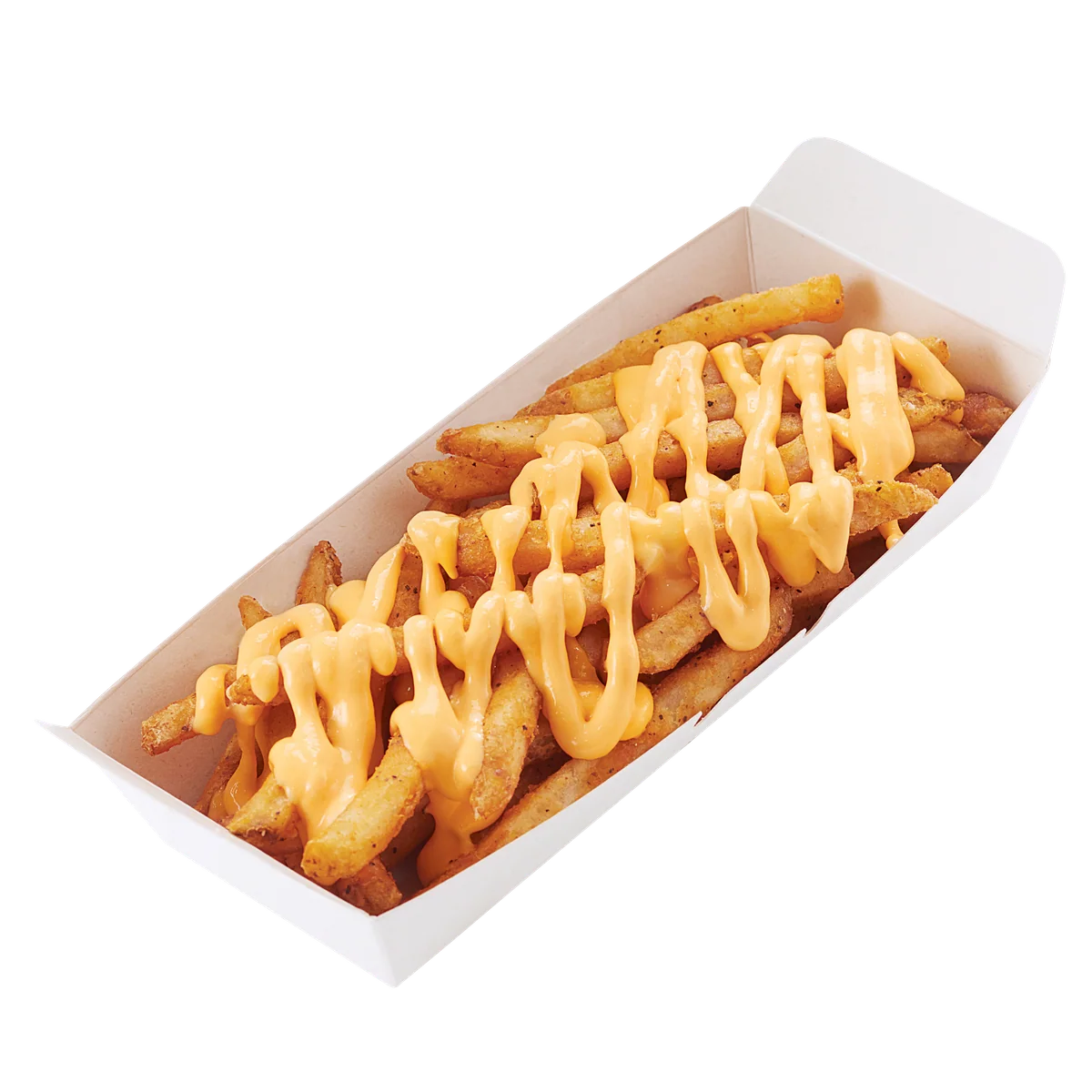
Sides
4 photos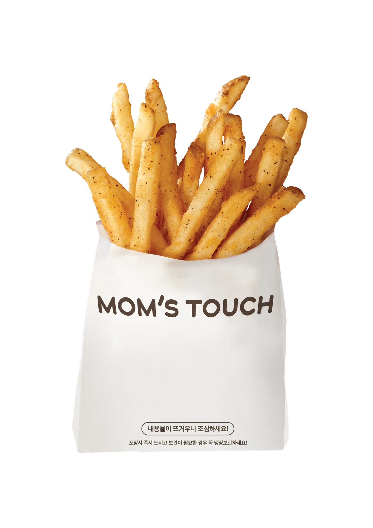
Brand typeface
Headlines and brand expressions use Gotham Rounded Bold. The Mom's Touch Mongolia website uses the same Gotham family for continuity.
Press inquiries
For interviews, partnership requests, or full brand guideline access, please reach out by email.
The complete brand guideline document is confidential and available on request.
Email us →